City Builder
Citi Venture’s place-based investing platform that enables investors to customize their search and find incentive programs that have the potential to reshape communities.

Project overview
City builder provides investors access to socio-economic data that breaks down census tract information, housing affordability, workforce participation, and other aspects of investment potential. Having this data on one platform allows investors to make a positive impact today and in the future.
City Builder has a global reach, and the responsive website has a presence within the United States, Togo, Italy, Jordan, and recently, Ukraine. City Builder's resources have led to increased investor capital and more equitable communities.
This case study details my design process of three design enhancements, estimated cost filter, investment incentive zones, and historical data.
My role
Sr. Product Designer
Team
City Builder is a product of the Citi Ventures team that works within Citibank.
Specialties
Product strategy
Implementing UX research
Design enhancements
Ideation
Interaction design
Design systems
Prototyping
Collaboration
Product Managers
UX Research
Design
Engineering
Year
2022
Design process
I worked on 30+ enhancements within City Builder. For each enhancement I used a simple and effective design process. Within these enhancements, I use benchmarking, ideation, implementation of UX research, and prototyping to turn complex data into consumable and pixel-perfect designs. I work with the design and product teams daily through each step of the design process.
Define
Collaborate with research and product teams to identify user needs, discuss goals, and understand data.
Ideate
Brainstorm ideas with mockups and benchmark designs.
Prototype
Narrow down ideas, iterate designs and implement feedback.
Refine
Create pixel-perfect, ready-to-hand-off design files.
THE USER PROBLEM
Investors want to impact communities while yielding a return on their investment. Few resources measure the impact for investors looking to elevate communities with their investments.
THE SOLUTION
Enhance the City Builder platform to provide insight to allow investors to make educated decisions and foster their next step in investing.
ONE | ESTIMATED COST FILTER
As a user, I want to filter investment projects by estimated cost within census tracts.
Acceptance criteria
Add filter by investment value (estimated cost)
The filter needs to be adjustable by a user
Data provided by UX research and product team
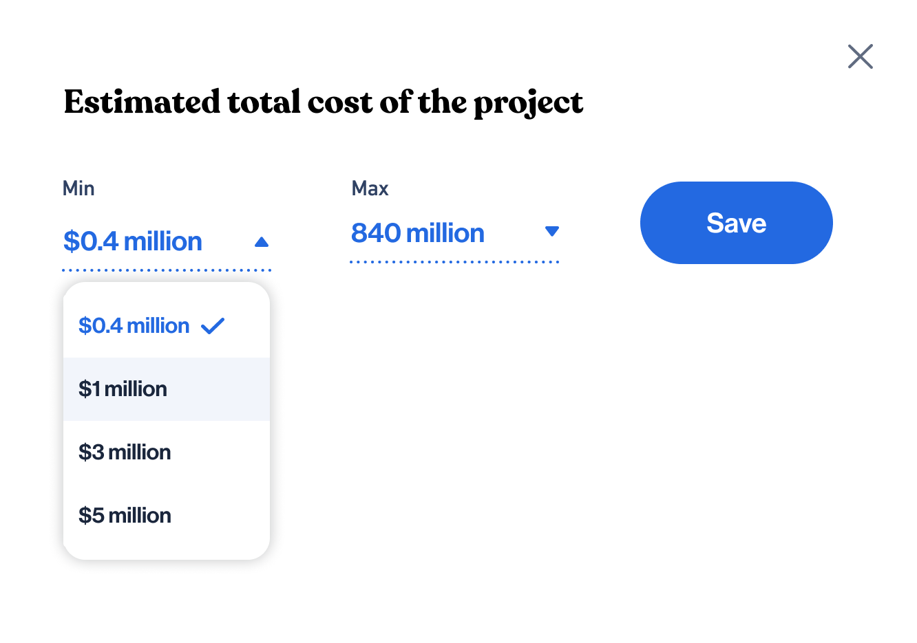
The range for the estimated cost of filter are $250,000 to $875,000,000
Increments $250,000
Benchmarking
Benchmarks such as Airbnb, VRBO, Zillow, and Redfin had different ways of adjusting a range based on an area and user interests.
The sliders and drop-downs from benchmarking provided context for ideation. I designed sliders, graphs, and dropdowns using our content and data.
Ideation


Design direction
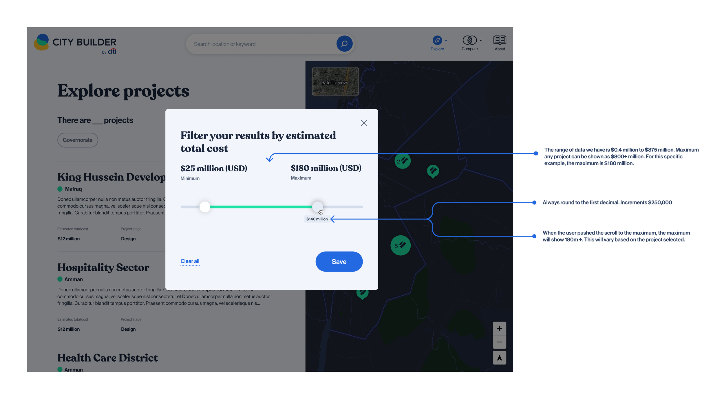
We moved forward with this slider because the design allows users to pick a cost range quickly, and the hover state provides instant feedback.
Prototyping
I changed the handles to be the same component, and I added a drop shadow to show the selected state.
Final Designs
Finals included animation and mockups of the different stages of the slider. Try the estimate cost filter here.


Breakpoints included the different shapes of the module, along with the size changes of the hover state and slider components.
Breakpoints

XL1440

L1280

M1024

S768

XS320
Hand-off included parameters that outlined how the slider and numbers would work together. This included the range acceptable for the slider and how to round the hover state.
Hand-off
TWO | INVESTMENT INCENTIVE ZONES
As a user, I want to view details about Jordan's development and free zones. I want to know what investment options are available within these zones.
Acceptance criteria
Represent the Jordan development zones and free zones per governorate (equivalent to a US state).
Validate with engineering that it is possible to use multiple shapefiles for this approach.
Explore pins on a map and additional tabs.
Data provided by UX research and product team
Development Zones are areas that are often in or near cities where the government/ministry encourages investment and development by offering financial advantages such as tax incentives.
Free Zones benefit investors and developers by offering incentives for doing business in specified areas of the country. Investors can be exempt from income tax on exports of goods or services outside the kingdom, as well as transit trade.
The name and location of the development/free zones
The shape and scale of the zone compared to the governorate.
Benchmarking
We used various maps and tools including Google Maps, All trails, and Waze to generate ideas.
Ideation
I explored ways to show development and free zones and how they may relate to projects so investors could capitalize on their investments.
Seperate tabs
A tab for "incentives" displays the development and free zones separate from local institutions and projects.
Realistic zone shapes
Using the real zone shapes illustrate how the zone is relative to the governorate.
The sidebar
The sidebar provides information about selected projects, institutions, and zones.
Filters and pins
The filter and pins demonstrate how the zones, projects, and institutions relate.
Prototyping
Prototyping the options allowed the team to understand how the user would interact with each design. The prototypes demonstrate the interactive states, links and filtering options.
Seperate tabs
This prototype has a separate tab, “Incentives” to show development and free zones. This option was the most similar experience to the other maps we have in City Builder.
Filters
For this prototype, I used filters to show zones, institutions, and projects at the same time.
Edge case
Prototyping edge cases can create insights. For example, what would happen if multiple projects and institutions were very close to each other? The bottom prototype shows how a user can hover over a pin to expand the clickable options.
Sidebar
With a sidebar, information about the zones, projects, and institutions is available for the user to view all at once. We believe this feature encourages users to spend more time exploring.
Final Designs
We chose the "Separate tabs" arrangement as our final design. Additional maps within Citi Builder have separate tabs similar to this option, and the design keeps consistency within City Builder.


Breakpoints
Breakpoints show how the map changes between devices. Mobile has the most significant change to accommodate space and slick states.

XL

L

M

S

XS
Hand-off
This particular hand-off was important to discuss interactions and differences between the breakpoints.
THREE | HISTORICAL DATA
As a user, I want to see trend data over time for socioeconomic needs to understand how data points have shifted to help guide my research and decision-making.
Acceptance criteria
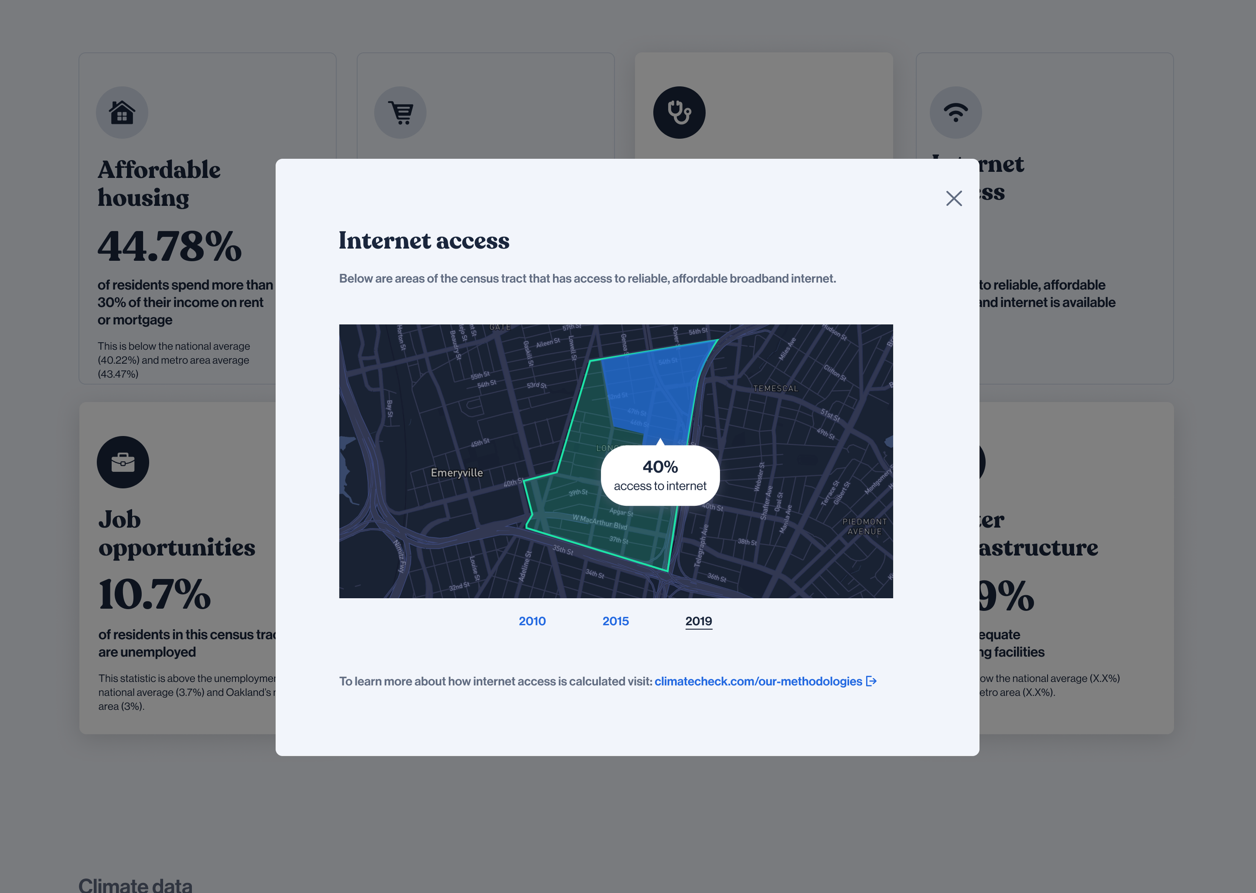
Explore how to display incremental historical data from 2010 - 2019 for socioeconomic needs
Datasets available: housing affordability, internet access, workforce participation, student engagement, and water infrastructure
Display data from 2010, 2015 and 2019
Data provided by UX research and product team
Student engagement data is only available for 2010 and 2019
Actual data provided to prototype realistic scenarios
Grocery availability is a yes/no data set
Benchmarking
I examined line graphs, pie charts, and bar graphs. I was curious how other companies presented similar data with interactive elements.
Ideation
I was looking for ways to present data for 2010, 2015, and 2019 that demonstrated how the specific socioeconomic need was trending. We wanted the visual to be interactive while showing all the necessary information.


Design direction
We moved forward with a line graph with specific points and pop-up hover states.
This design presents how the specific socioeconomic need is trending, and the user can identify data points quickly and accurately. The user has an overall view and can interact with the graph to look deeper.
Prototyping
I presented the prototypes to the product and engineering teams.
We learned that specific socio-economic needs only have data in 2010 and 2019, and we would have to remove the 2015 data point for those graphs.
Final Designs
Finals illustrated animation, user flows, and mockups. Mockups presented the data points needed per socio-economic need. We also delivered edge cases such as Grocery Availability, which was a checkmark instead of a line graph because of the available data.


Breakpoints
Breakpoints provided context on how the module size would change for each device. On mobile, the user was sent to a separate page to accommodate space.

XL1440

L1280

M1024

S768

XS320
Hand-off
During the hand-off meeting, I presented prototypes of the pop-up animation. We discussed hover states and edge cases involving different data.
Takeaways
Each design enhancement increases helpfulness and insightfulness to our users. By providing information about zones, socio-economic trends, or investment value, we help our users make educated decisions and enable their next step in investing.
My Experience
I enjoyed working on this project because of the collaborative efforts and the potential impact on communities. I hope our efforts continue to help communities and foster impactful investments.


